

Model Explainability#
Understand why a forecasting model makes the predictions it does, using feature importance scores and per-timestep SHAP contributions.
What you’ll learn:
Inspect global feature importance with an interactive treemap
Compute per-timestep feature contributions (SHAP values)
Visualize contributions with heatmaps, waterfall charts, and bar charts
Note
This tutorial uses a small data slice for fast execution.
See examples/benchmarks/ for production-scale runs.
Key API references:
ExplainableForecaster
· ContributionsPlotter
· FeatureImportancePlotter
Train a model#
We reuse the same setup as the Forecasting Quickstart — train a GBLinear model on 45 days of Liander data.
from datetime import datetime, timedelta

from openstef_core.testing import load_liander_dataset
from openstef_core.types import LeadTime, Q
from openstef_models.presets import ForecastingWorkflowConfig, create_forecasting_workflow
from openstef_models.presets.forecasting_workflow import GBLinearForecaster

dataset = load_liander_dataset()

train_start = datetime.fromisoformat("2024-03-01T00:00:00Z")
train_end = train_start + timedelta(days=45)
forecast_end = train_end + timedelta(days=7)

train_dataset = dataset.filter_by_range(start=train_start, end=train_end)
predict_dataset = dataset.filter_by_range(
    start=train_end - timedelta(days=14),
    end=forecast_end,
)

workflow = create_forecasting_workflow(
    config=ForecastingWorkflowConfig(
        model_id="explainability_gblinear",
        model="gblinear",
        horizons=[LeadTime.from_string("PT36H")],
        quantiles=[Q(0.5), Q(0.1), Q(0.9)],
        target_column="load",
        temperature_column="temperature_2m",
        relative_humidity_column="relative_humidity_2m",
        wind_speed_column="wind_speed_10m",
        radiation_column="shortwave_radiation",
        pressure_column="surface_pressure",
        verbosity=0,
        mlflow_storage=None,
        gblinear_hyperparams=GBLinearForecaster.HyperParams(n_steps=50),
    )
)

result = workflow.fit(train_dataset)
print("Training complete.")
print(result.metrics_full.to_dataframe())
Training complete.
   quantile        R2  observed_probability
0       0.5  0.411875              0.151389
1       0.1 -0.996094              0.010185
2       0.9  0.732109              0.388657
Feature importance#
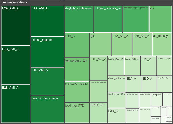
Feature importance scores rank features by their overall impact on the model’s
predictions. The FeatureImportancePlotter treemap visualization groups features by magnitude — larger
tiles represent more influential features.
Feature contributions#
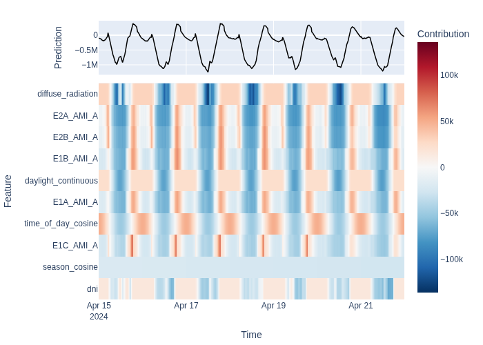
While feature importance is a global summary, feature contributions explain individual predictions. For each timestep, they decompose the prediction into additive terms: one per feature plus a bias.
GBLinear models provide exact SHAP values, making this decomposition faithful
to the model’s internal logic. Use ContributionsPlotter
to visualize contributions as heatmaps, bar charts, or waterfall charts.
from openstef_models.explainability import ContributionsPlotter

contributions = workflow.model.predict_contributions(predict_dataset, forecast_start=train_end)

print(f"Contributions shape: {contributions.data.shape}")
print(f"Features: {contributions.data.columns.tolist()[:5]} ... ({len(contributions.data.columns)} total)")
Contributions shape: (672, 46)
Features: ['temperature_2m', 'relative_humidity_2m', 'surface_pressure', 'cloud_cover', 'wind_speed_10m'] ... (46 total)
Heatmap — contributions over time#
Each row is a feature, each column is a timestep. Red cells indicate positive contributions (pushing the prediction up), blue cells indicate negative ones. The prediction line overlays the total.
Bar chart — average feature impact#
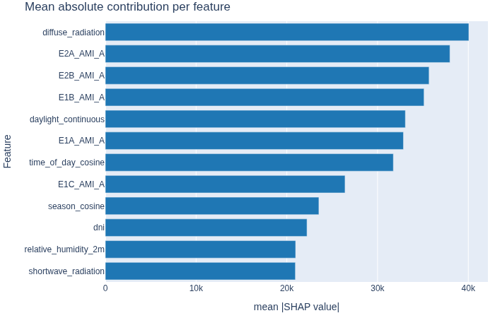
Mean absolute contribution per feature, ranked from most to least impactful. This gives a complementary view to global importance — here you see which features actively moved predictions during the forecast window. If certain features dominate unexpectedly, consider adjusting the pipeline via Building a Custom Pipeline.
Waterfall — single timestep decomposition#
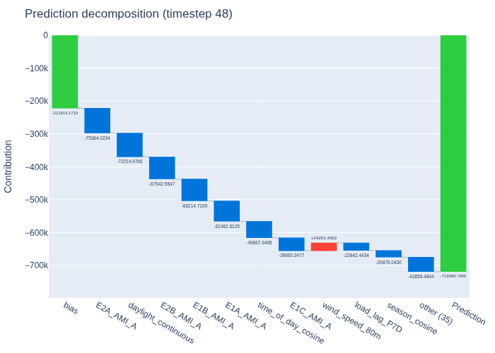
The waterfall chart breaks down one specific prediction into its components. Starting from the bias (baseline prediction), each feature adds or subtracts from the final value.
Ensemble model weights#
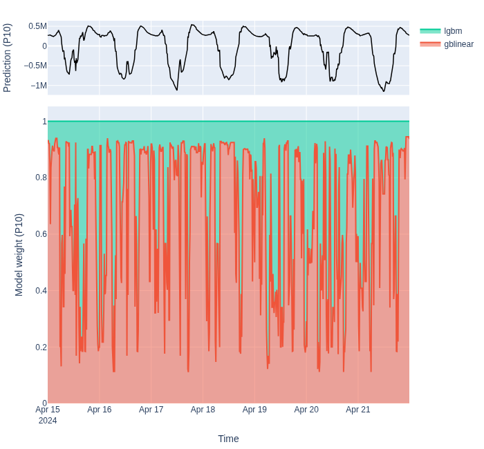
For each forecast quantile, a classifier estimates which base model is likely to perform best. Its predicted probabilities become nonnegative model weights that sum to one at each timestep. The top panel shows the ensemble forecast for the selected quantile; the stacked area below shows each model’s weight. The plot defaults to P50 when no quantile is specified.
[2026-10-22 13:48:13,411][WARNING] No aggregation functions specified. Skipping fit.
[2026-10-22 13:48:13,412][WARNING] No aggregation functions specified. Returning original data.
[2026-10-22 13:48:13,575][WARNING] No aggregation functions specified. Returning original data.
[2026-10-22 13:48:13,759][WARNING] No aggregation functions specified. Returning original data.
[2026-10-22 13:48:15,708][WARNING] No aggregation functions specified. Returning original data.
[2026-10-22 13:48:17,083][WARNING] No aggregation functions specified. Returning original data.
[2026-10-22 13:48:17,233][WARNING] No aggregation functions specified. Returning original data.
fig = ModelContributionsPlotter.plot_stacked_area(
    model_weights,
    forecast=ensemble_forecast,
    quantile=Q(0.1),
)
fig.update_layout(height=650)
fig.show()
# fig.write_html("ensemble_model_weights.html", include_plotlyjs=True)
Next steps#
Hyperparameter Tuning with Optuna — use explainability insights to guide which parameters to tune.
Building a Custom Pipeline — fine-tune feature engineering based on what the contributions reveal.